Maps of the world and regions with spmap
Maps can be a visually striking and effective way to communicate geographical patterns in data. Stata does not have a ton of support for map-making or GIS operations, but there is a good user-created command that we can use to make nice choropleth maps. These show the values of variables by coloring areas in different colors.
The command in question is called spmap. We can download and install it by typing ssc install spmap. We only have to do this once.
However, we also need geographical data. For spmap, this consists of shapefiles that have been transformed into coordinates that Stata can use to plot the maps. We can use the command shp2dta to do this for any shapefile. However, it takes some work to match the units in the shapefiles to the data we might want to plot.
But I have some good news: I have done this for you! I have used the shapefiles of countries from Natural Earth, and matched them to the QoG country data. I have created spmap coordinate files that we can use to draw maps of the World, but also regional cutouts of Europe, North America, South America, Africa and Asia.
In general, I have used the Mercator projection, but it unfortunately distorts the areas around the poles a lot. On Mercator world maps, Greenland looks about the same size as Africa, when in fact, Africa has 14 times larger surface area!
I have therefore also provided coordinate files for the cutouts of Europe and North America with the Lambert Conformal Conic projection, which gives a more accurate view of these areas.
Data files
Here are the files you will need to download to draw the maps. The first one is an ID file, that is required to match the codes in the QoG data to the coordinates in the other files. Download the files you want and put them in a project folder.
Then we have the coordinates files, one for each map. The most comprehensive one is of course the world map, but then there are the regional cutouts.
World - Mercator
Europe - Mercator
Europe - Lambert
North America - Mercator
North America - Lambert
North America - Mercator
South America - Mercator
Africa - Mercator
Asia - Mercator
Merging the QoG data to the ID numbers
First, we need to set a folder so we can easily find the different files. I have put a downloaded version of the QoG data, together with the id file and the coordinate files in a folder on my computer, and will start with telling stata where that folder is located (using the cd command). Then we load the dataset.
cd "/users/xsunde/Dropbox/Jupyter/stathelp/data/GIS/"
use "qog_bas_cs_jan18.dta", clear
Now we need to match the data in the QoG dataset to the id numbers needed for the maps. We do this by merging the id file to the QoG data, matching on the numerical "ccode" variable. It is possible to do so because I have prepared the files accordingly; if you want to make your own custom map using other shapefiles, you might need to match on country names. We use a one-to-many merge merge 1:m since there are more units in the id file than in the QoG data (for instance for small dependencies).
merge 1:m ccode using "idfile.dta", nogenerate
Now we have a new variable in the dataset called "na_id_world". This is the ID file we are going to use when we make the maps.
Making a world map
Let's create a map that shows life expectancy in the world. The principle behind the spmap command is that we type the command, the variable we want to plot, then the coordinate file, and then an option for what our id variable is called. we want to plot the variable "wdi_lifexp", the coordinate file is called "coord_mercator_world.dta", and the id variable is as mentioned earlier "na_id_world".
To make the map look a bit nicer, we also add the option fcolor(RdYlGn) that sets the color scheme to sequential from red through yellow to green. Higher values (meaning people live longer) will be green. Use help spmap and click on "colorlist" to get the full range of options.
spmap wdi_lifexp using "coord_mercator_world.dta", id(na_id_world) fcolor(RdYlGn)
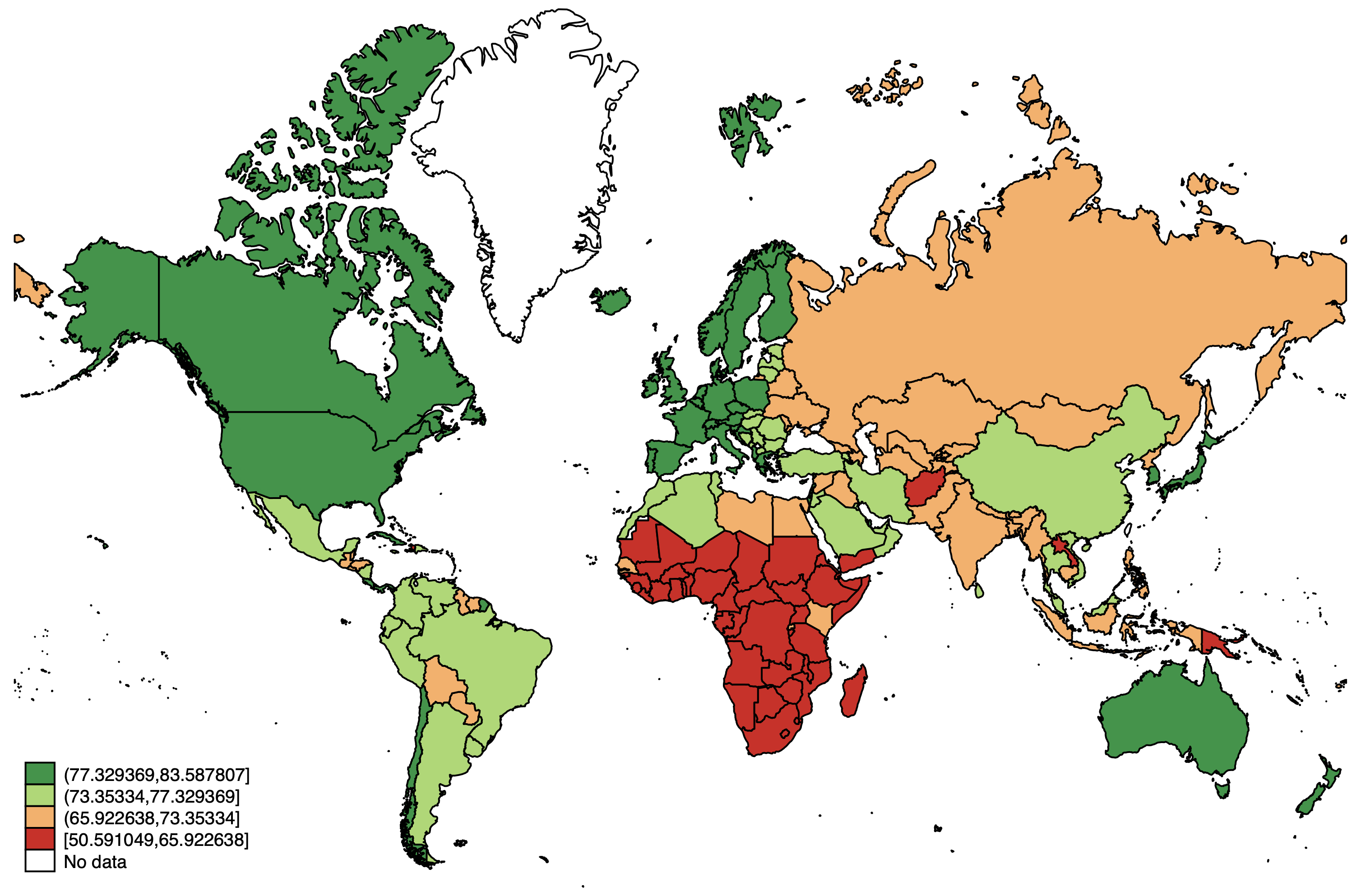
Not too bad, if we remember that the arctic regions are NOT as big in reality. But we can make some improvements. We can customize the break points for the different categories using the clmethod(custom) clbreaks() options. Let's set it at 10-year intervals, to make the map easier to read. I also like to deemphasize the borders with the osize() ndsize(vvthin) options. In the osize parentheses, we need to type the line width once for each non-missing category (so four in this case). Finally, let's add a title that explains what the map shows.
spmap wdi_lifexp using "coord_mercator_world.dta", id(na_id_world) fcolor(RdYlGn) ///
osize(vvthin vvthin vvthin vvthin) ndsize(vvthin) clmethod(custom) clbreaks(50 60 70 80 90) ///
title("Life expectancy at birth")
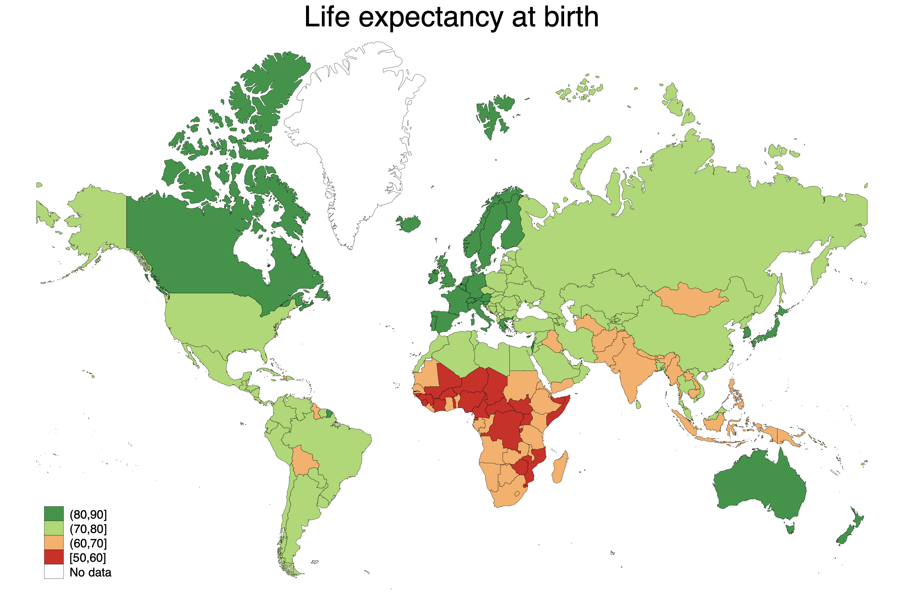
Much cleaner! We can use graph export "map.png", replace to save the map as either a .png or .pdf file. If it is going to be used on the web, .png is much more flexible. But If you want to put it in a report, saving it as a .pdf usually yields the highest quality.
Regional cutouts
Now let's look at some regional cutouts. We can choose to plot only a few countries by using if qualifiers in the spmap command. We can there say exactly which countries we want to plot. However, it is complicated by the fact that some countries have overseas territories. If we plot France, we get territories in South America on the same map, which makes mainland France very small. Therefore, I have created these cutouts to make the process easier.
Too get some variation, let's now plot the Corruption Perceptions Index ("ti_cpi") in the data. We plot the data in the exact same way, we just use a different coordinate file (and some other options to customize the map). Let's take the cutout of Europe, where we use the Lambert projection so as not to overemphasize the nordic countries. I have removed the options about the custom breaks. I also added an option ndfcolor(gray) to make the areas without data gray. This is to separate them from the oceans.
spmap ti_cpi using "coord_lambert_europe.dta", id(na_id_world) fcolor(RdYlGn) ///
osize(vvthin vvthin vvthin vvthin) ndsize(vvthin) ndfcolor(gray) ///
title("Corruption Perceptions Index")
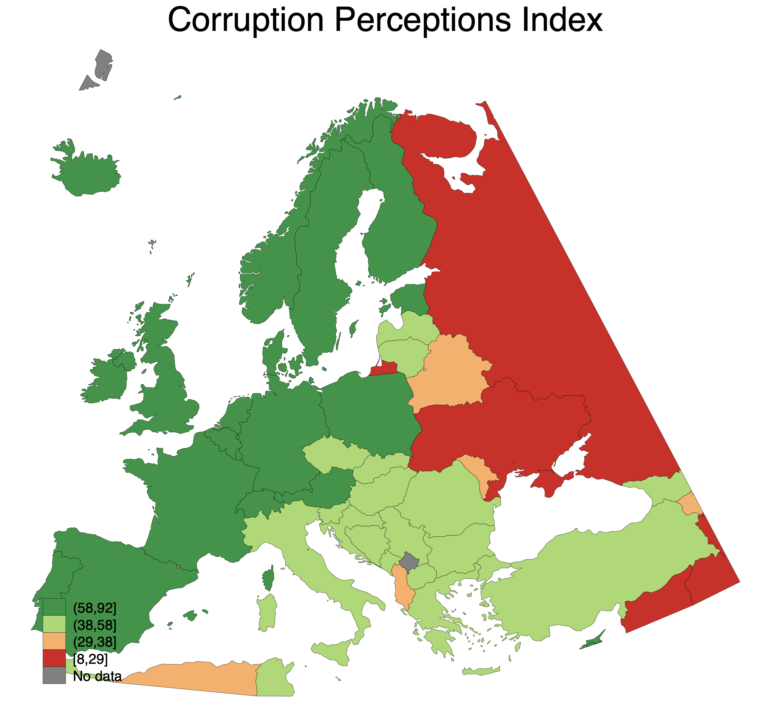
With this project we get a better sense of the scale of different countries. Sweden has a pretty large surface area, but not as large as the Mercator projection gives the impression of.
Now let's try the Africa cutout, and plot the level of democracy (using the p_polity2 variable). We can also use a different color scheme, from purple to blue to green (it is probably not the most pedagogical, but just to show the variety):
spmap p_polity2 using "coord_mercator_afr.dta", id(na_id_world) fcolor(PuBuGn) ///
osize(vvthin vvthin vvthin vvthin) ndsize(vvthin) ndfcolor(gray) ///
title("Polity index")
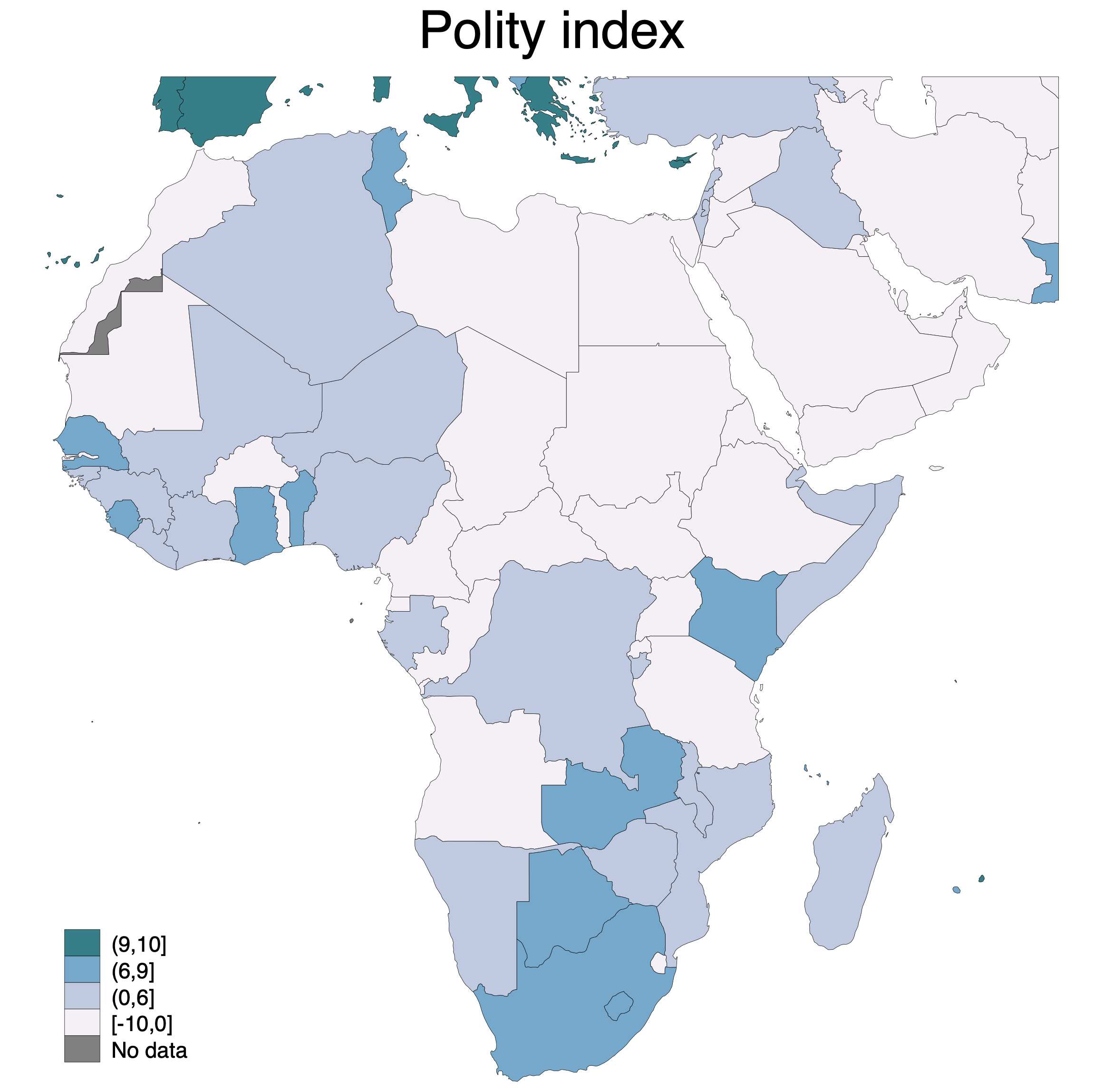
Notice that we also get some parts of Southern Europe on the map. This makes the depiction more accurate, but it might also be a bit distracting. So we can compare the map above to a world map where we instead if qualifiers to select regions to plot. We can use the "ht_region" variable, which has the value 3 for North Africa and the Middle East, and 4 for Sub-Saharan Africa. So now we set the coordinate file to the world map again:
spmap p_polity2 using "coord_mercator_world.dta" if ht_region==3 | ht_region==4, id(na_id_world) fcolor(PuBuGn) ///
osize(vvthin vvthin vvthin vvthin) ndsize(vvthin) ndfcolor(gray) ///
title("Polity index")
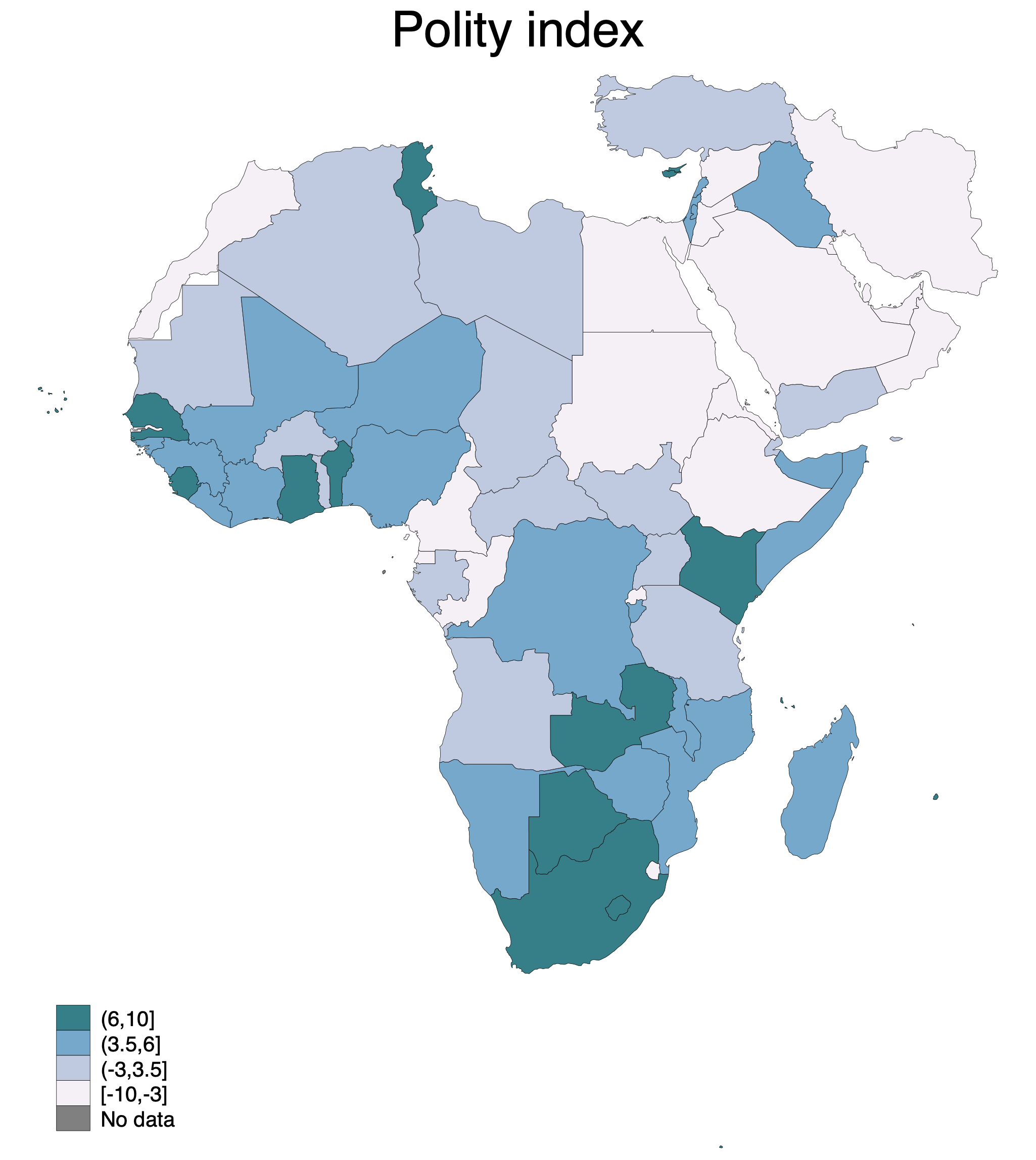
Cleaner, but one can also get the impression that Iran in the top right is surrounded by water, which it is in fact not. A matter of taste! Also notice that the intervals changed; by default, spmap places the same number of countries in each category. Since we have now excluded the European countries, countries can go in the top category with lower democracy scores. The data is the same in both maps, only the divisions are different.
Making maps with V-dem data
The ID file also contains variables that allow for matching with the V-dem data. To do that, open up the V-dem data, which is a time-series cross sectional dataset. Then delete all but the most recent year using keep if year==2018.
After doing so, you are ready to merge with the ID file, this time using the variable "country_id", which is tailored to match specifically with the V-dem data.
use "../V-Dem-CY-Core-v9.dta", clear
keep if year==2018
merge 1:m country_id using "idfile.dta", nogenerate
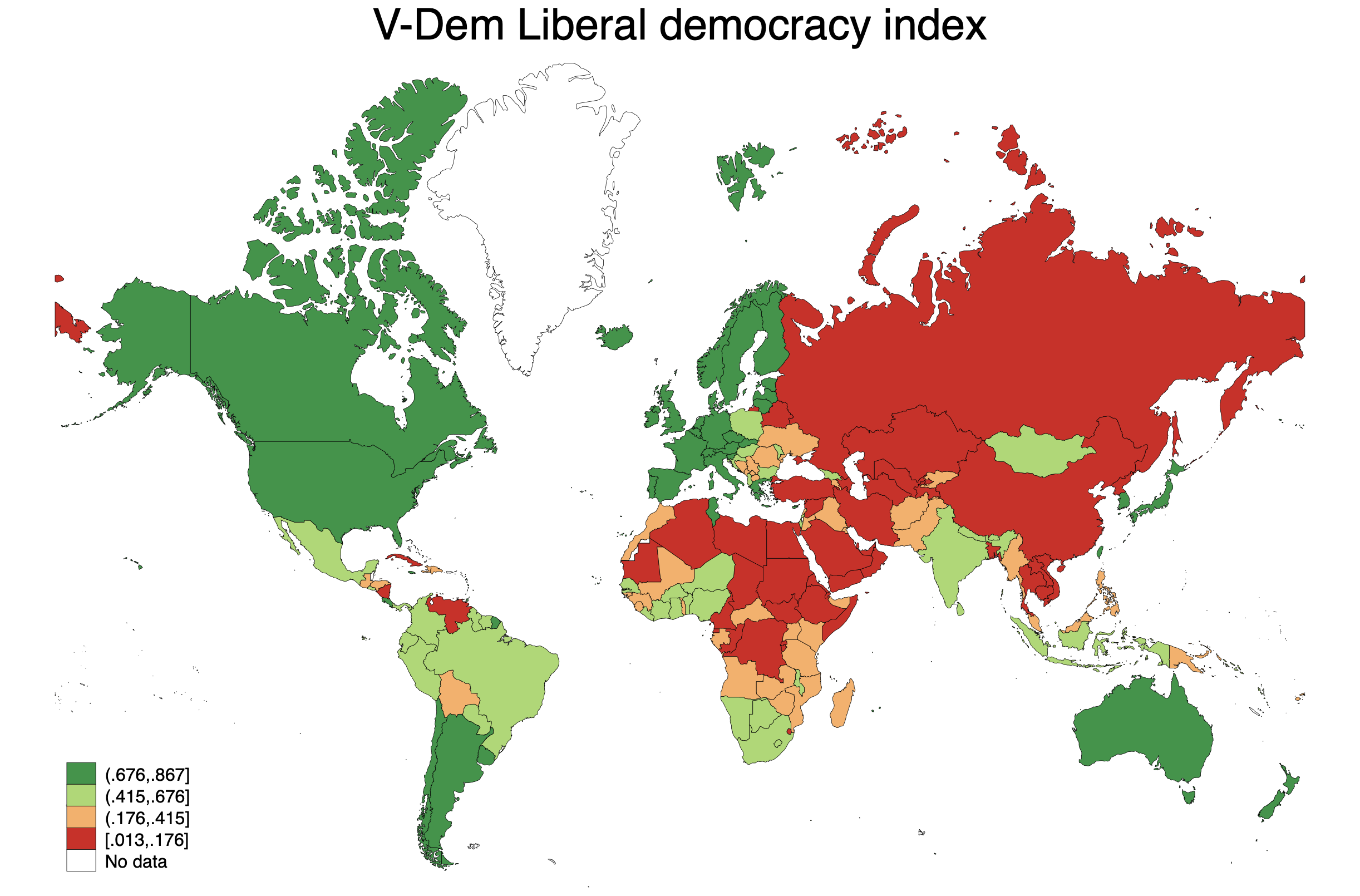
Now we can make a map in the same way we did above. Here is a map that shows V-Dem's "Liberal democracy index" (v2x_libdem).
spmap v2x_libdem using "coord_mercator_world.dta", id(na_id_world) fcolor(RdYlGn) ///
osize(vvthin vvthin vvthin vvthin) ndsize(vvthin) title("V-Dem Liberal democracy index")
Conclusion
The coordinate files linked above work with the QoG ccode variable, which is present in both the cross-sectional data (used here) and in the time series data. However, borders change over time, so one needs different shape files to show the situation further back in time. The same applies when using the V-Dem data.
The QoG data can also act as a key if you want to add data from other sources; it for instance includes World Bank country codes. Use merge to add more data.
A word of caution: When you try to plot a variable for which there is no data, spmap will draw the borders but label it as "no data", which is reasonable. However, if you use if qualifiers, for instance to select one year in a time series cross sectional dataset, spmap will not draw borders of exluded countries. If countries suddenly disappear from your maps, check whether you are using if qualifiers that exclude them somehow.
Also make sure to check out help spmap to see all the available options for customizing the map. There is a lot to do with legends, colors, backgrounds and so on.